Online dating has been around long enough that we now have millions of data points on what actually works. From OkCupid's legendary research blog to academic studies analyzing swipe behavior, the science of attraction has never been clearer.
We've spent months studying this research to build Zygnal. Today, we're sharing the most important findings—and what they mean for your profile.
The Distribution of Attractiveness (Spoiler: It's Not What You'd Expect)
Let's start with the uncomfortable truth. When researchers ask people to rate potential matches, the responses follow a predictable pattern—but not the one you'd expect.
If attractiveness were purely subjective and randomly distributed, you'd expect a nice bell curve. Most people in the middle, fewer at the extremes. Mathematically elegant.
That's not what the data shows.
How Men See Women
When men rate women's attractiveness, the distribution is remarkably close to normal. The ratings form a near-perfect bell curve centered around "medium" attractiveness.
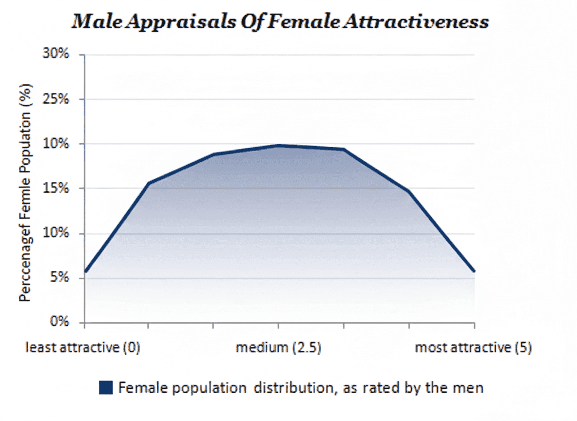
Men distribute their ratings fairly evenly—about equal numbers rated as below average and above average. The curve peaks right at the center, suggesting men perceive female attractiveness on a relatively balanced scale.
How Women See Men
Now here's where it gets interesting. When women rate men, the distribution shifts dramatically left:
Female ratings of male attractiveness:
| Rating Range | % of Profiles |
|---|---|
| Most Attractive (top 20%) | ~7% |
| Above Average | ~18% |
| Medium | ~34% |
| Below Average | ~29% |
| Least Attractive | ~12% |
Women rate roughly 80% of men as "below average." The distribution doesn't just skew left—it practically falls off a cliff at the "medium" mark.
This isn't about who's actually more attractive. It's about perception and standards—and they're dramatically asymmetric.
But Here's the Plot Twist: Messaging Behavior
If you stopped at the attractiveness ratings, you'd think men have it impossible. But the research reveals something fascinating: people don't message according to their ratings.
How Men Message
Men's messaging behavior closely tracks their attractiveness ratings. They send more messages to women they rate as more attractive—shocking, we know.
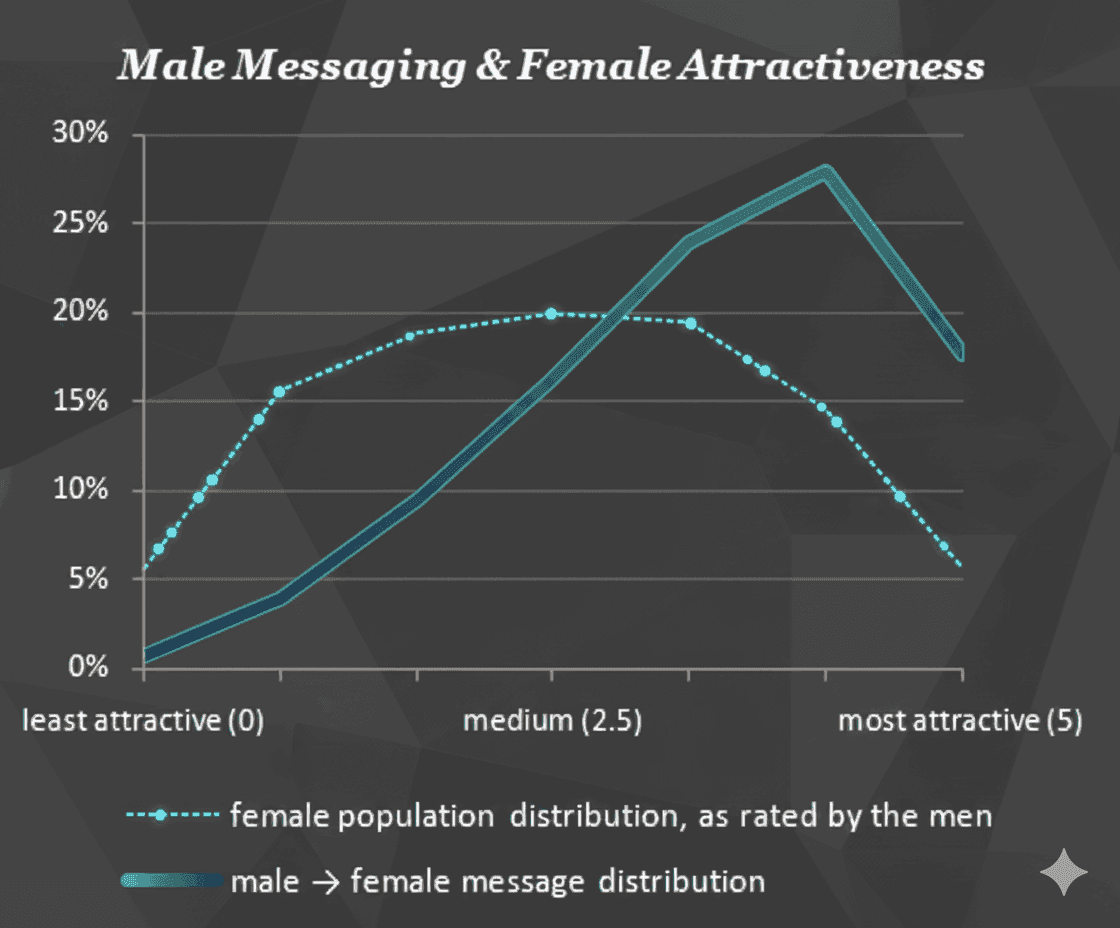
The solid line shows where men's messages go. It skews heavily toward the most attractive women—far more than the population distribution would predict. Men are essentially all competing for the same small pool of highly-rated women.
How Women Message
Here's the surprise. Despite rating 80% of men as below average, women's messaging behavior tells a completely different story:
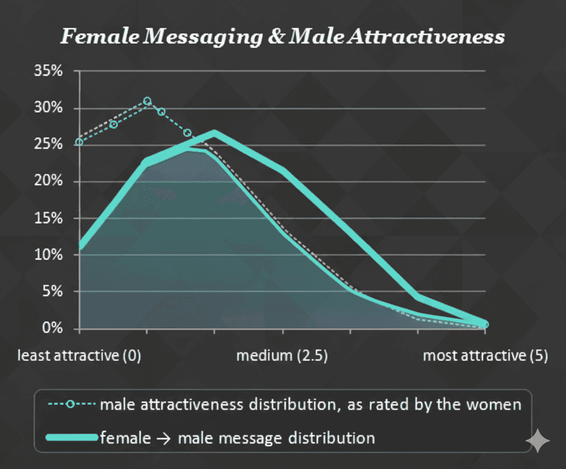
Women's messages are distributed much more evenly across the attractiveness spectrum. They rate harshly but message generously. A man rated as "below average" still receives substantial message volume from women.
The research suggests women use visual attractiveness as just one factor among many. Men, by contrast, let looks dominate their decision-making almost entirely.
The Message Volume Gap
This asymmetry creates massive disparities in how many messages people receive:

For women (lighter line), message volume increases exponentially with attractiveness. A woman in the top tier receives roughly 25x more messages than a woman at the bottom.
For men (darker line), the curve is much flatter. Yes, more attractive men get more messages, but the multiplier is around 5x—not 25x.
What this means:
- If you're a woman, your photos matter enormously for message volume
- If you're a man, your photos matter—but other factors (bio, opening messages, timing) play a larger relative role
Message Success: Does Attractiveness = Replies?
Getting messages is one thing. Getting replies is another.
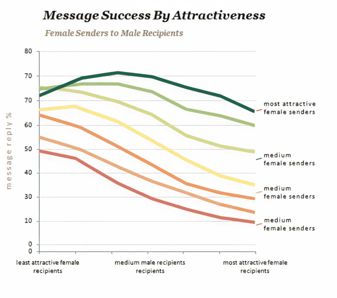
Female Senders
When women send messages, their reply rate depends heavily on both their own attractiveness AND the attractiveness of the men they're messaging:
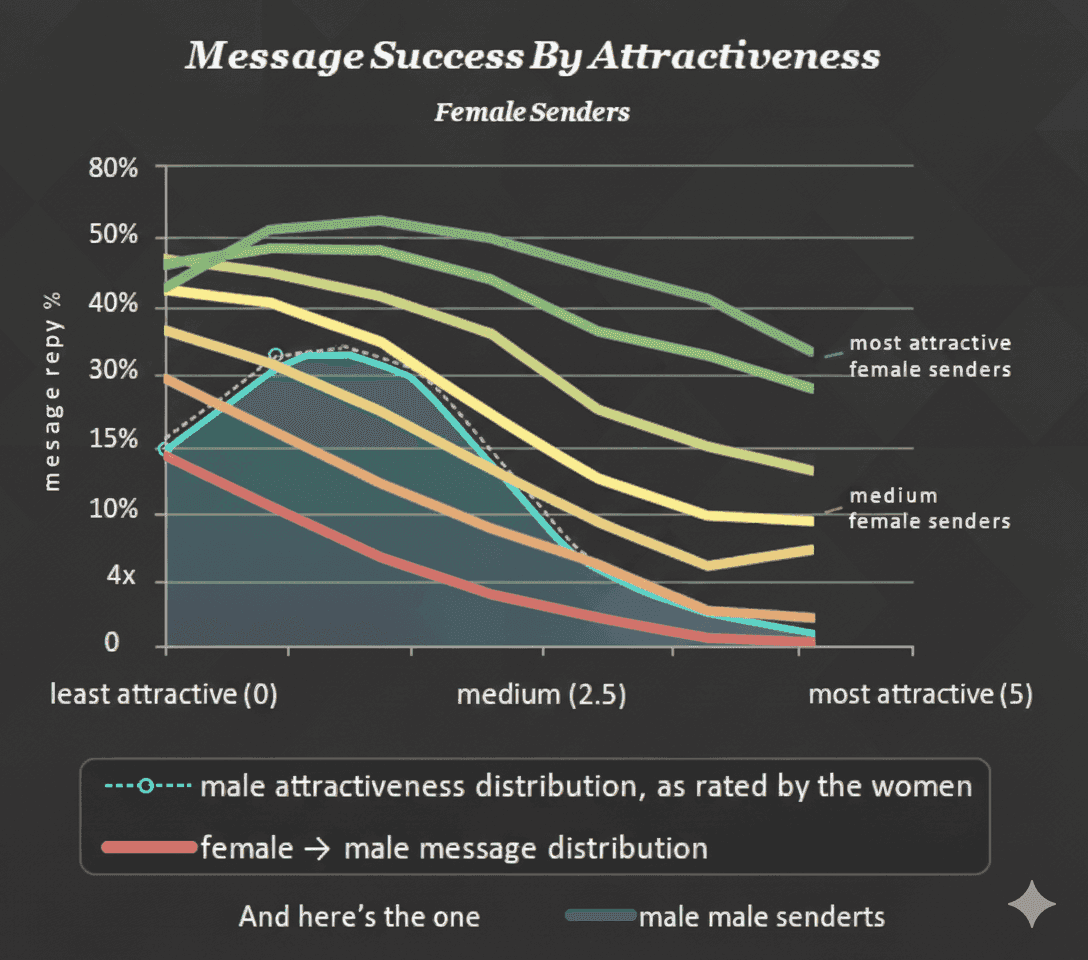
The most attractive women (top lines) get replies from almost everyone they message. Less attractive women still get decent reply rates—but those rates drop when they message highly attractive men.
Male Senders
For men sending messages, the pattern is similar but more compressed:
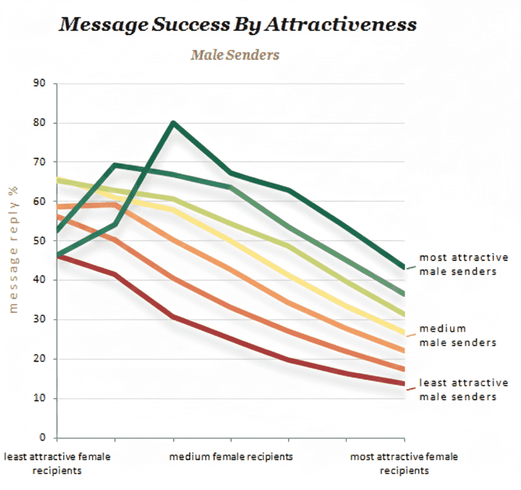
Even the most attractive men see reply rates drop when messaging the most attractive women. The competition at the top is fierce for everyone.
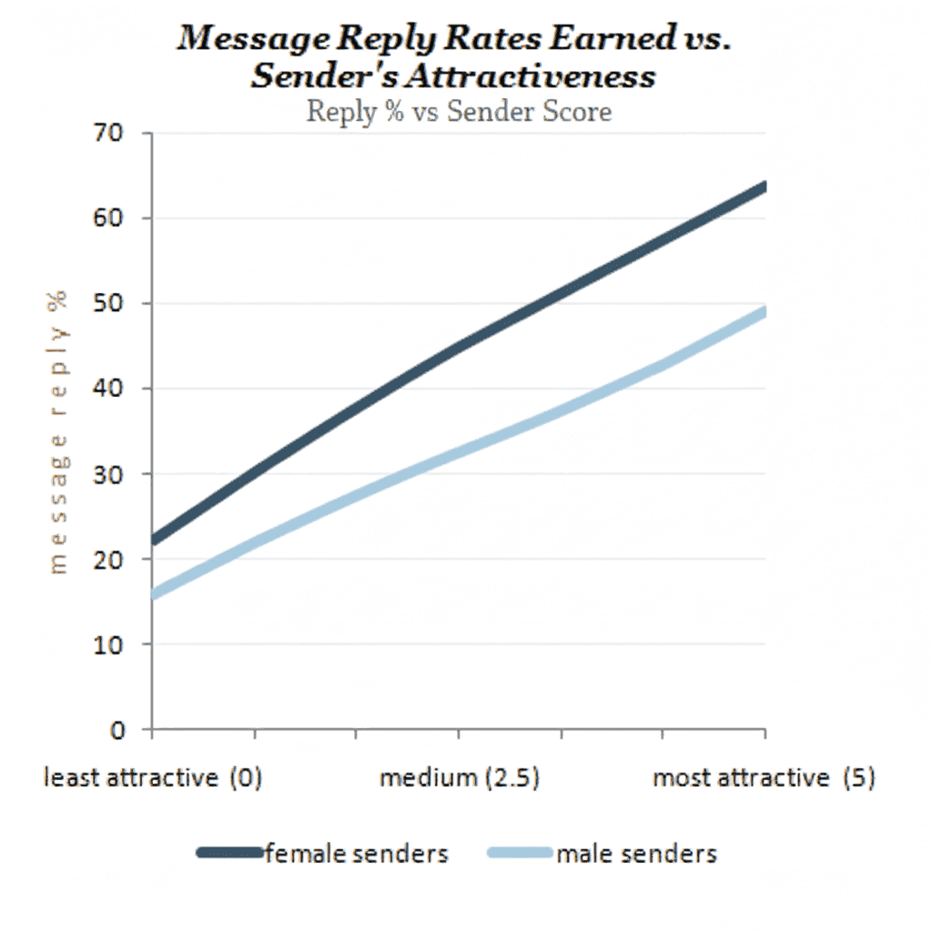
The Combined Picture
When we look at overall message success by sender attractiveness:
Both genders see massive improvements in reply rates as their own attractiveness increases. But the gap between male and female senders is stark—women consistently achieve higher reply rates at every attractiveness level.
What This Research Means for Your Profile
These patterns have been consistent across millions of interactions over more than a decade. The implications are clear:
1. Your Photos Are Everything (Especially Your First One)
Research shows your primary photo accounts for roughly 60-70% of someone's decision to engage with your profile. Everything else—bio, other photos, prompts—splits the remaining 30-40%.
Most people lead with the wrong photo. Studies suggest 60-70% of users would perform better with a different primary image.
2. The Group Photo Problem
You might think appearing with less attractive friends makes you look better by comparison. The research says otherwise:
| Photo Type | Relative Performance |
|---|---|
| Solo shot | Baseline |
| Group (you're most attractive) | -10% |
| Group (you're average) | -20% |
| Group (you're least attractive) | -35% |
Group shots underperform solo shots even when you're clearly the best-looking person. Reasons include:
- Cognitive load: Viewers must identify who you are
- Comparison risk: Any comparison introduces uncertainty
- First impression window: You have 1-2 seconds—don't waste them
3. Polarization Beats Consensus
This is perhaps the most counterintuitive finding. Profiles that polarize—getting strong "yes" and "no" reactions—outperform profiles that get universal "maybe" responses.
| Profile Type | Match Rate |
|---|---|
| Polarizing (high variance) | ~5% |
| Consensus (low variance) | ~3% |
Dating apps aren't about being liked by everyone. They're about being loved by someone. The "maybe" pile is where profiles go to die.
4. The Bio Matters Less Than You Think
Controlled studies show bios account for only 9-15% of swipe decisions. This doesn't mean bios don't matter—they affect conversation quality and date conversion. But for the initial swipe? Photos dominate.
The most effective bios:
- Under 200 characters
- One specific, memorable hook
- Show genuine personality
- Include a conversation starter
The worst bios:
- Negative statements ("Don't bother if...")
- Lists of requirements
- Generic phrases ("I love to laugh")
- Emoji-only content
The Actionable Takeaways
Based on years of research across millions of profiles:
Fix Your Photo Order
Your best photo should be first. Your perception of your "best" photo is statistically likely to be wrong—that's why tools like Zygnal exist.
Kill (or Bury) Group Shots
Move group photos to position 4-6, or remove them entirely. Lead with clear solo shots.
Embrace What Makes You Different
Bland profiles get "maybe" responses. The quirks that turn some people off are the same things that make others swipe right hard.
Prioritize Lighting
Natural light > Ring light > Flash > Dark room. This is the single most improvable technical factor.
Keep Your Bio Short
Under 200 characters. One hook. Make them curious.
Why We Built Zygnal
All this research existed—but it wasn't actionable. You couldn't easily test which of your photos actually performs best with real people.
Zygnal changes that. We show your photos to real users who vote honestly on each one. You get a VCI score for each photo and your profile overall—real data instead of guesswork. For a deeper look at our philosophy, read From Chaos to Compatibility.
The patterns in this article have been validated millions of times. Now you can apply them to your own profile.
Stop guessing. Start optimizing.
Download Zygnal to get your VCI score and discover which of your photos is secretly helping—or hurting—your match rate.